You Had Me at Design
Most of you are probably familiar with the Dollar Shave Club by now, but if you’re not, head over to their website to learn more about the subscription based service. I was made aware of their presence through those sneaky ads that were popping up within my Facebook news feed. Initially, I kept moving past the Dollar Shave Club ads like I normally do for everything else, but I always caught myself pausing before moving on. Over time, that pause turned into action, and there is one simple reason why: design.
All businesses rely on design, whether they know it or not. According to Patrick Newbery and Kevin Farnham’s book, Experience Design, “In creating, marketing, and delivering value, design is used to make sure that the end result is what business believes will be effective enough to connect with customers and help them realize the value they are seeking.” The design of the Dollar Shave Club’s ad spoke to me. It showed me the product and service had value, and piqued my curiosity enough so that I clicked on the ad, checked out the service, and ended up signing up as a member to test it out. All because of the way it was designed.
Living most of my days in a digital world, I always get excited to see packaging that leads me through a story with a strong narrative. So when my introductory shipment was delivered, I wanted to take the time to document what I found and relate what my experience was for all the people who’ve said to me “yeah, I’ve heard about the Dollar Shave Club. Please tell me what you think of it.” But more than wanting to try out the actual razors themselves to see whether or not they gave me a smooth shave, I wanted to try out the design.
The Goods
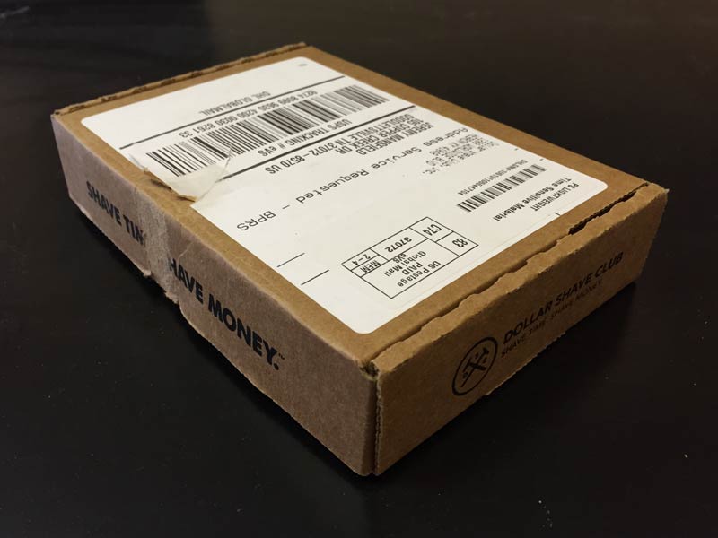
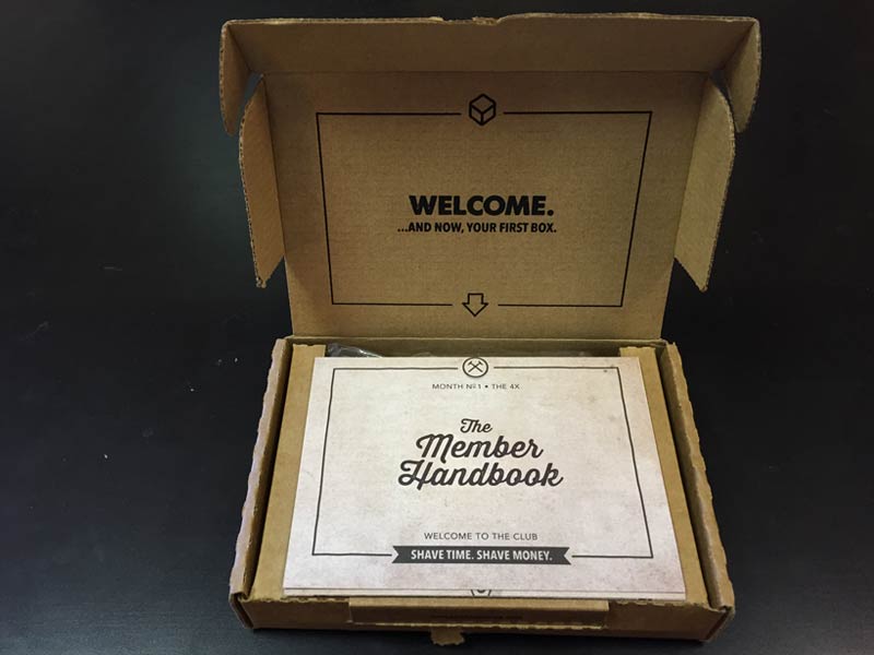
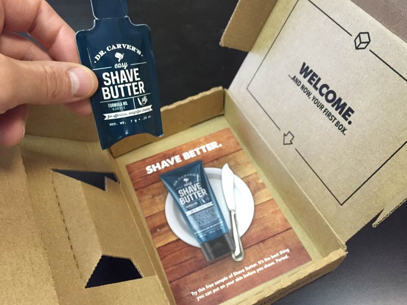
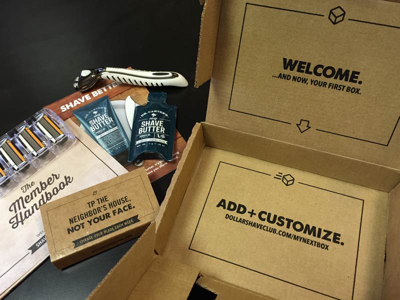
Our good friend, Bill Seaver, over at MicroExplosion Media has written about how everything is marketing now, and the guys at Dollar Shave Club definitely get that. From their tagline and branding on the sides of the box, to the custom new member welcome message and new member handbook, and the “easter egg” messages that are continually revealed throughout the opening process, the Dollar Shave Club crew has worked hard to make sure their messaging is meaningful, memorable and clear.
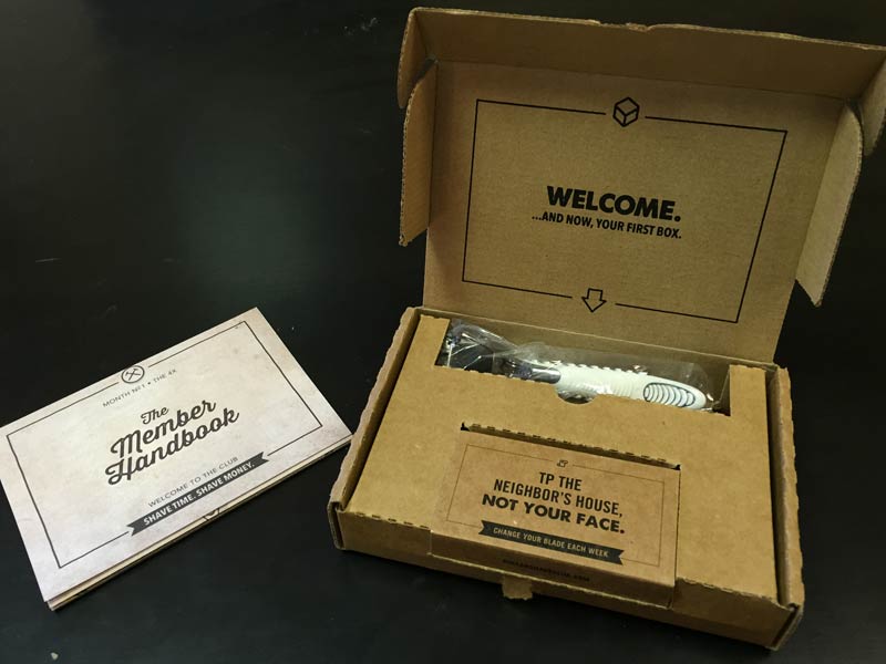
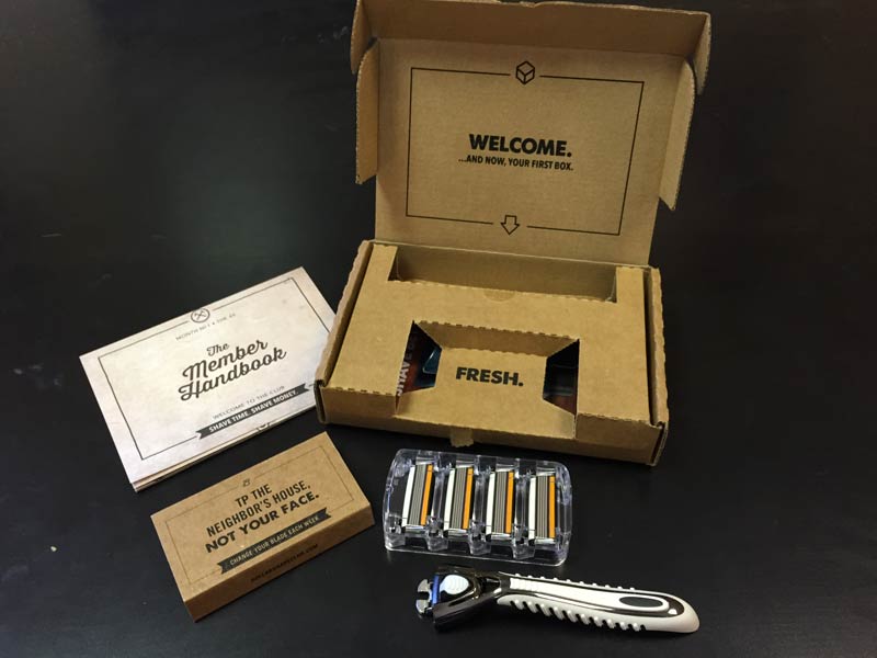
They even did a great job of saving space for up-selling some of their accessory products, such as their Dr. Carver’s Shave Butter. Because according to them, it helps you shave “better”. And to be quite honest, I did feel like I had a smoother shave because of it.
As an old professor told me in design school a long time ago, “the purpose of design is not to make things look good, but to be good.” It just so happens that the crew over at Dollar Shave Club has been able to do both. Their messaging was meaningful, memorable and clear, and their razors gave me a good shave for the money. The added bonus of not having to run to the store when I realize I’m out of fresh blades is definitely worth the price of admission into this subscription based club. So in the spirit of their advertising and messaging, go forth, and save the T.P. for your neighbors yard.
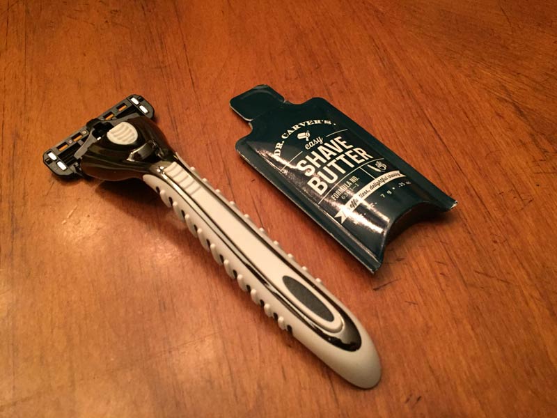
If you’re looking for a more detailed review of the actual shaving process itself, head over to About.com. Also, be sure to follow @DollarShaveClub on twitter to stay tuned to their latest promotions and offerings.

 November 15, 2014
Thanks for the link to the blog!